The authors of this blog, Tiina (UX Designer from Codemate) and Jani (QA Coach from Hidden Trail), found themselves working on a joint customer case last fall as they realised that their mindset and areas of interest were in fact really close to each other.
Thus began the tale of two consultants that were seemingly worlds apart, discovering that they shared a common interest: the quality of the products they worked on. Despite approaching it from different perspectives – one focusing on User Experience (UX) and the other on Quality Assurance (QA) – they realised that their work was ultimately driven by the same desire to make the world a better place. This tale sheds light on the fascinating intersection of UX and QA, and how their collaboration can lead to a superior product.
QA vs UX or QA and UX?
It’s common to think of the product development cycle as having separate stages for design, development, and testing. But at the end of the day, everyone on the team is working towards the same goal: creating the most user-friendly and effective product possible. Each team member brings their own expertise to the table and has a unique perspective on how to achieve the best possible user experience. In particular, there is a special interrelation between the roles of QA and UX.
One way to describe the similarities between QA and UX is: “For a digital product, software bugs are a measure of the technical quality, where usability is a measure for the quality of the design.” Let’s break this down a bit.
Software testing is one tool of quality assurance to find out information about the product. The information is then used to guide the development and other decisions. It can have multiple approaches, but let’s use a common one: functionality. Does the product do what it is supposed to do? This we can find out by testing: exploring the specifications, the user interface, asking from the end users etc.
Usability testing on the other hand, is a tool to test the success of the design. It can reveal unclear wording on action buttons, poor use of colors and contrast or confusing layout that prevents users from achieving their goals.
It doesn’t matter if you have a product with flawless usability if it sends all the information to the wrong places or a mobile application with zero bugs but an inadequate user experience. You simply need both.
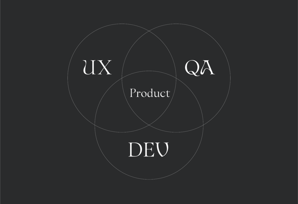
“Quality assurance (QA) and user experience (UX) are two sides of the same coin:
- One side of the coin represents usability, which is a crucial quality measure for design. Therefore, a good UX requires QA thinking to ensure this.
- On the other side of the coin, many other quality factors beyond the user interface impact the overall UX too.”
The famously elusive Quality
What does quality mean? What is quality in digital products? There have been many attempts to define quality in software and here is another: a quality is a characteristic, like “she is a likeable person” or “this mobile app is very straightforward to use”. Furthermore, in product design, it is a characteristic that is valued or creates value for a stakeholder.
In a great product, there are several good or great value-adding qualities and they create the overall experience of greatness of the product. These great qualities or characteristics vary depending on your business model, markets and your product. So, good quality is not a universal thing but a context-dependent thing.
Quality means business
Many digital products and services operate in a highly contested business space. You need to move quickly to get the revenue and customers, you need to produce value for your customers to keep them, and you need to build a desirable story to grow the customer base. How do you design and validate these things? This is where user experience design and quality assurance start to have common ground, as we have found out working together with our customers.
You need to understand your quality ecosystem and set your goals correctly. If your product doesn’t sell, there is something wrong in some of its qualities.
In this article, we’ll talk more about why understanding your overall context is so important in developing great and winning digital products and services.
How we worked together in a project
Last fall we (the authors) were working together on the same project for the first time. During some daily meetings, we both mentioned our plans to conduct end-user interviews. That’s when we both had a realisation – why not do the interviews together? By working together we could gain different perspectives and insights into the users’ needs!
In order to create a solid plan and strategy for QA activities in digital product development, we need to understand the factors that contribute to a successful product. We need to understand the motivation and quality goals of the organization we do the development with. We need to map out the important things that have the most impact on the end product quality. As there are no “one size fits all” solutions for good quality, the trail there needs to be mapped through knowing the organisation, people, processes and their motivations and goals. This mapping starts with interviewing people and finding out these details. From there we can create a map of the quality ecosystem that contains the common goals as well as the possible pitfalls and how to avoid them by applying correct QA activities throughout the product development cycle.
The core of design thinking is a human-centered approach to problem-solving. A UX-designer has to understand the perspectives of the user and empathise with their needs. Interviews are also used to identify pain points and generate new ideas. Based on the user interviews UX designer can create user personas to help the whole team to focus and empathise with the human using the product and create customer journey maps to visualize the experience and highlight pain points and moments of success encountered on the way. Designing without a clear understanding of the user’s needs is like building a house without a solid foundation. Conducting interviews ensures that the result is not only aesthetically pleasing but also functional and meets the needs of its intended users.
So as we can see, both UX and QA are interested in humans and how they see the world around them. Both disciplines use a human-centered approach in both problem solving and designing their actions. The differences are mainly in the application of the information gathered. In UX design, the information is used to visualize and document the real needs of the user that guides how to design the right product. In QA, it is used to create processes and common understanding of the quality to know how to build the product right.
Summary and takeaways
When the QA and UX are conducting the same interviews, they both have the same base knowledge of the user’s needs. Through this shared knowledge, the Designer doesn’t have to explain the placement of the navigation buttons and QA knows what’s more important to test, the check-out flow or the user profile page. There are also other steps where QA and UX can work together to ensure the quality of the product.
When UX designers are conducting usability testing sessions with end users, the QA can observe and note any technical issues or bugs that arise during the testing. During software development, the QA can identify defects and bugs that affect user experience, and actually, they can do this even in the early phases of layout design!
Both UX and QA people like to be part of product development all the way from ideation through development into production use. Both disciplines benefit from early involvement and it increases the quality of their work. UX should not be treated only as a “layout design factory” and QA should not be treated only as a “last quick checkpoint before launch”.
By working together and having continuous communication every step of the way, UX and QA can ensure that the product is both usable and high-quality, leading to a better user experience overall.
This blog was originally published on Fusion Ecosystem’s blog.
About the authors

Tiina is a self-proclaimed crazy dog lady with a passion for usability and a straightforward approach to problem-solving. Tiina values functionality and reliability over aesthetics and can’t stand when things don’t work as they should. With her studies in service design, Tiina brings a unique perspective to every project, always keeping the end-user’s needs and experiences in mind.
Tiina Nykänen
Senior UX Designer, Codemate

Jani has over two decades of experience in the IT sector, ranging from coding, project management, agile parctices to test design and management. Quality thinking is Jani’s passion. He works with co-creation mentality, coaching and facilitating teams to achieve their own goals.
Jani Nykänen
Quality Coach, Hidden Trail
Want to learn more?
Minna is happy to share our view on quality.



 All articles